Insights Chart Enhancement - 2020 July
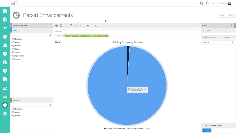
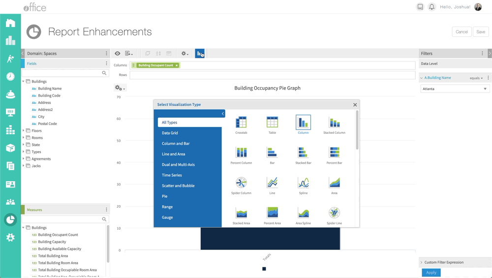
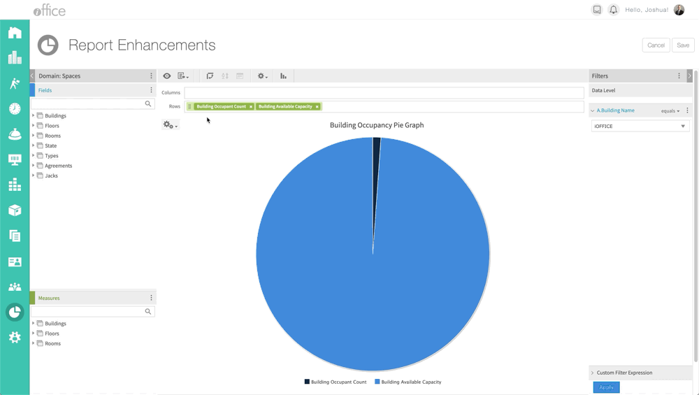
iOFFICE has released a new version of the Insights module. This update increases performance, security, and adds more features. The latest feature includes a wider selection of chart types. This will add more choices to charts and color selection and display metrics giving a better insight into your organization. One new chart type is the Gauge chart type. These chart types are handy for showing whether data values fall within an acceptable range.
New Chart Types
The new chart types are the circular gauge, the multi-level gauge, and the arc gauge. These gauges have formatting properties to set minimum and maximum values, colors for value ranges, if the value is displayed, and the value's number of decimal places and a suffix string such as the % sign.
Color Picker
The updated enhancements to the Dashboard Properties includes a new color picker within the Appearance tab for specifying colors to match any palette where visualizations are embedded. The default color selections are expanded, and custom colors may be specified precisely with HEX or RGB entry options.
With this new upgrade, it will add increased security, new chart visualizations, and improved ad-hoc customizations. If you have any questions or issues, please feel free to contact our customer support by calling 1-800-505-0224 or send an email to support@iofficecorp.com.