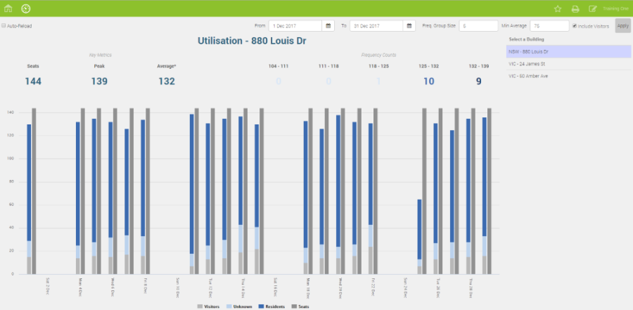
292 Badge Swipe Utilization Dashboard
Overview
Utilization Source: Badge Swipe data
This report is found on the Reports Dashboard.
Dashboard that displays the Badge Swipe Utilization statistics of a building for a selected date range. This gives you a good understanding of Badge Swipe Utilization trends over time.
Key Data
- Seats – are the total workpoints of the building.
- Peak – displays the highest number of people seen in one day during the date range.
- Average – displays the average number of people seen in the building each day during the date range.
- Frequency Counts – displays how many days in the period fell into different ranges of utilization (this gives the user an idea of how common the peak utilization was).
- Frequency Group Size – this parameter determines what % of utilization records falls into each of the 5 ranges displayed; if this is set to 20, all days will be displayed.
- Chart – displays the number of Residents, Visitors, and Unknown People in separate colors so that clients can easily understand who is using their space.
Tips
- The badge rows will show total badge swipes, for example the same person swiping multiple times a day, rather than the number of unique people.
- The report can be simplified for example, you can remove some elements such as the seat count bars or the frequency counts.