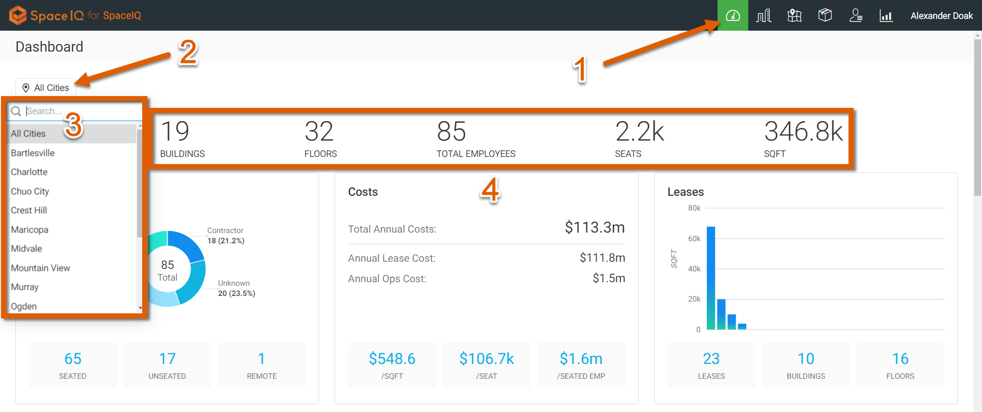
Dashboard Summary
The dashboard in SpaceIQ gives gives you a bird's eye view of your workspace assets across your entire organization or just a single city.
To view this information, click the Dashboard icon in the top main menu [1]. At the top, you will see a button [2] to filter your dashboard data to just one location [3]. A count of all Buildings, Floors, Employees, Seats, and Square Footage within your selected city is displayed [4] above the rest of the Dashboard widgets:
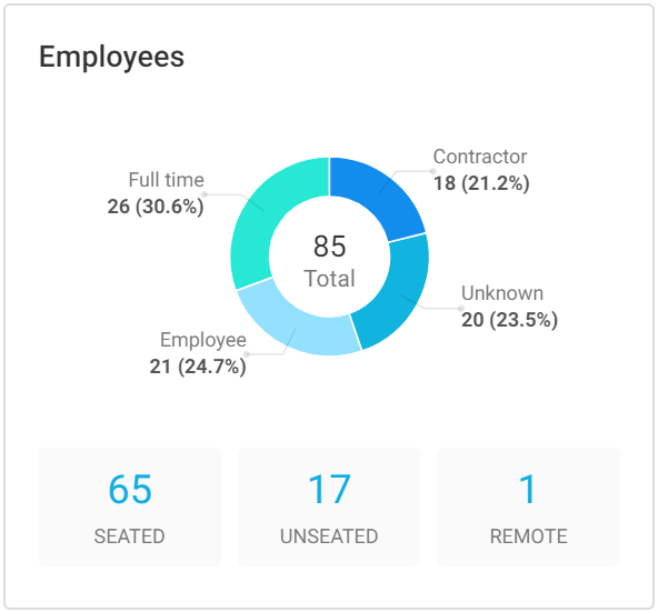
Employees
The Employees widget shows a breakdown of the four Employee types within your organization in a circle chart. Below the circle chart the seated & unseated counts are presented along with a remote employee count:
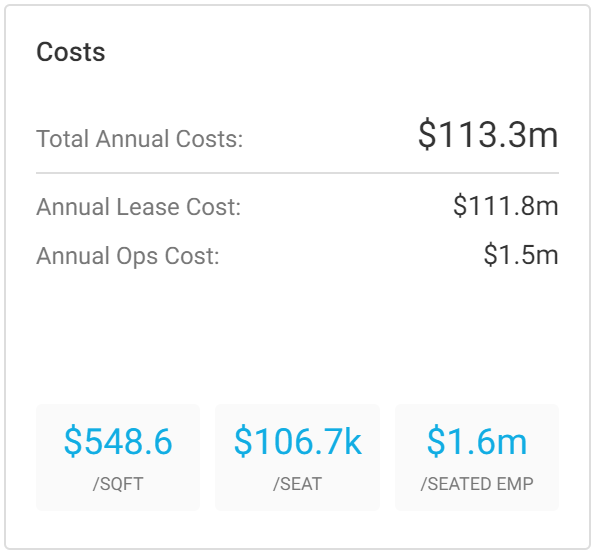
Costs
Your organization's annual real estate costs and operational costs are shown here. Note that this information will only be accurate if you add this data to the system as you create new buildings and locations. The cost per square foot, cost per seat, and cost per seated employee are also seen here:
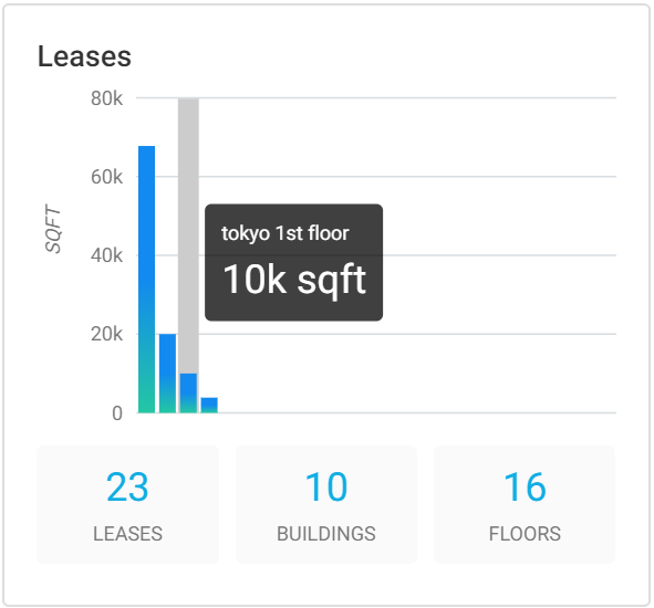
Leases
The leases widget is interactive, and you can see additional per-lease square foot details by hovering over the data. You also have here a total lease count, a leased buildings count, and a leased floor count:
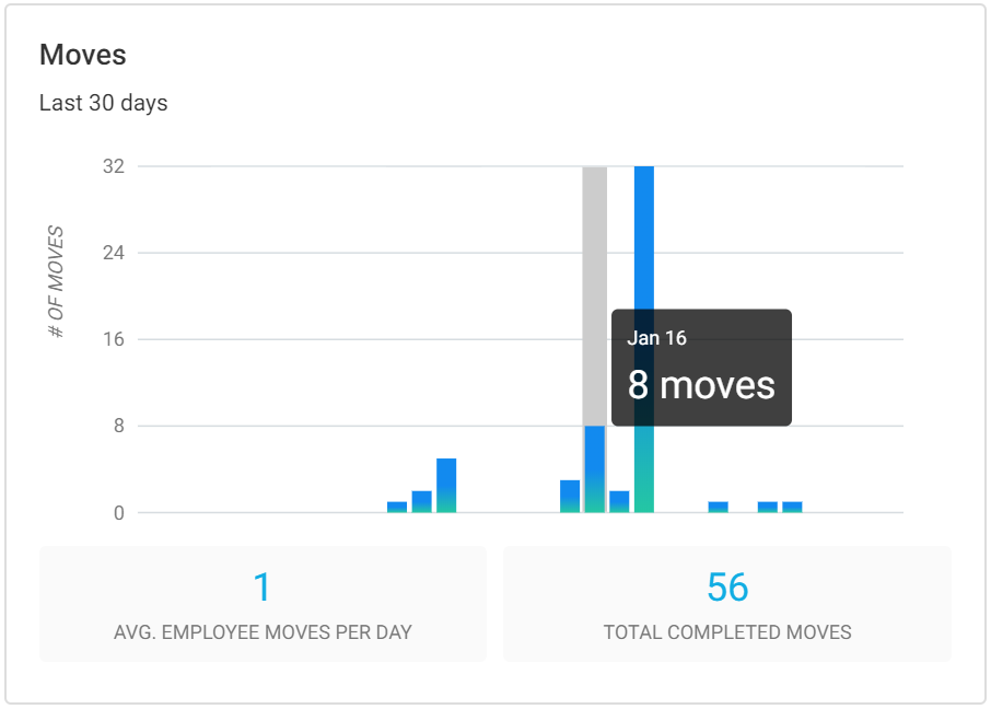
Moves
The Moves Dashboard chart is also interactive and shows the number of employees who have moved (not the number of move plans that have been executed). Note this chart is a rolling summary of the last 30 days:
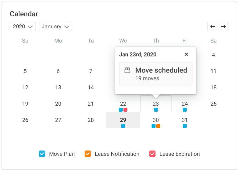
Calendar
The Calendar on the Dashboard is a great visualization tool to help understand when moves are coming in the proper context. By clicking on a date with a scheduled move (as indicated by a blue box), you can see how many moves are scheduled for that day. The widget also shows lease notifications and expiration:
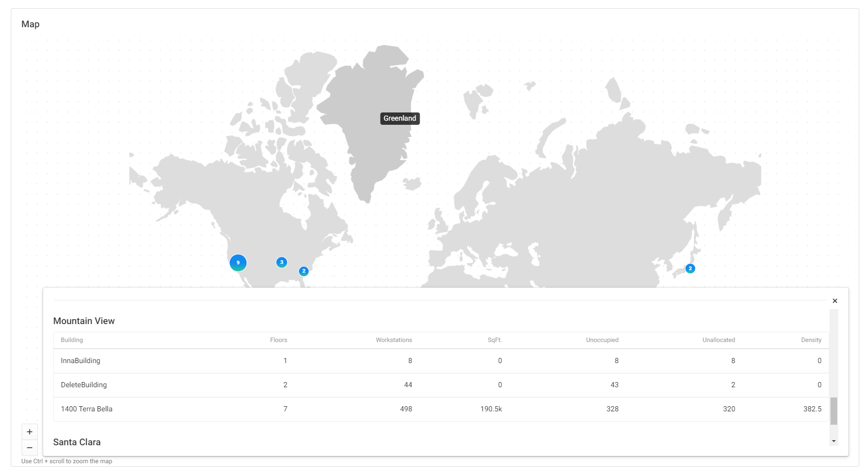
Map
We also have a Map interface on the Dashboard similar to our Global Map in the Portfolio view. There are a few differences, especially when it comes to previewing a location group by clicking on it: