Add or Remove Fields and Measures to a Table
Insert data into your table by adding fields. All fields are listed in the Data Source Selection panel, on the left side of the Reports Editor.
The fields are divided into two sections in the panel:
- Fields: can be added to the table as columns or groups.
- Measures: specialized fields that contain data values.
Add Fields and Measures as Columns to a Table
-
In the Data Source Selection panel, click to select the field or measure you want to add to the table. Use CTRL-Click to select multiple items.
-
Drag the selected item into the Columns box in the Layout Band. The field is added to the view as a column in the table.
Remove a Field or Measure from a Table
-
In the Layout Bank, click the x next to the field or measure’s name.
Change the Aggregation
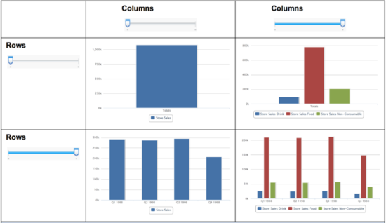
When you add a field or dimension to a column or row, a multi-level slider located at the top of the Filters panel allows you to set the level of aggregation to use for viewing the data. The number of fields or dimensions in the row or column determines the number of levels on the slider; measures are not reflected in the slider.
The following shows the effect of the slider on a chart with one level of aggregation for both rows and columns.
Change Date Grouping
If your chart includes data based on a date field, you can change the level of aggregation for the time data. To select the unit of time to chart:
-
Right-click on the date field in the Layout Band and select Change Grouping. Then select the time period you want form the cascading sub-menu.
The view updates to reflect the new date grouping.
Change the Summary of a Measure
You can get a new view of your data by changing the summary function of a measure, for example, from sum to average. To select a new summary function for a measure:
-
Right-click on the measure in the Layout Band and select Change Summary Function. Then select the function you want form the cascading sub-menu.
The view updates to reflect the new summary function.
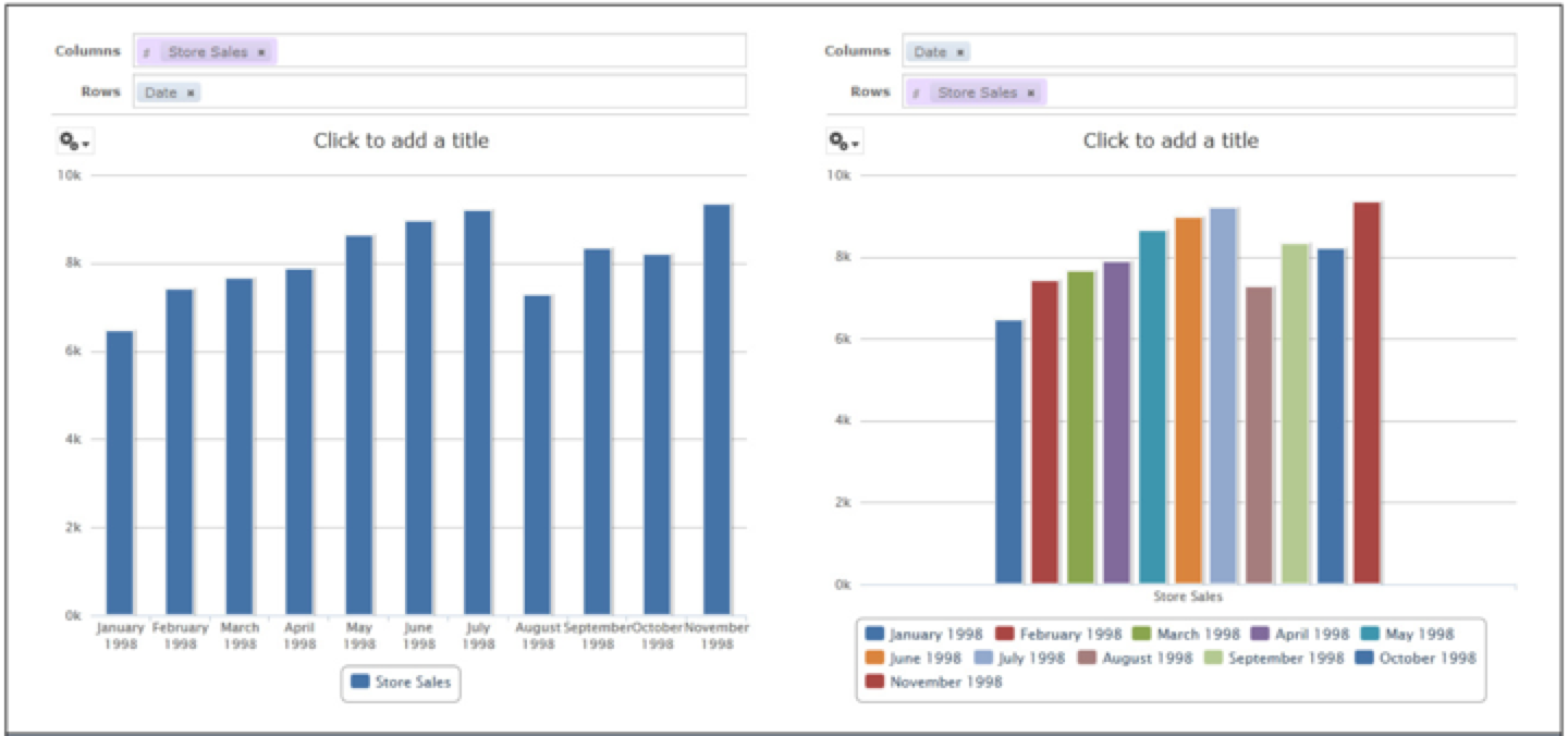
Pivot a Chart
In order to pivot a chart, perform the following step:
Click the Swich the groups ![]() icon. The row and column groups switch places; slider levels are maintained. The following figure shows the effect of pivoting a basic column chart.
icon. The row and column groups switch places; slider levels are maintained. The following figure shows the effect of pivoting a basic column chart.
Pivot a single group:
-
To pivot a single row group, right-click it and select Switch to Column Group. You can also move any field or dimension by dragging. You cannot drag a measure to a different group.
-
To pivot a single column group, right-click it and select Switch to Row Group. You can also move any field or dimension by dragging. You cannot drag a measure to a different group.