Working with Charts in the Insights Editor
Charts are a flexible, interactive way to explore your data graphically. You can choose different levels of aggregation for rows and columns, change a field from a column to a row, pivot the entire chart, hide chart values, and zoom in to see chart details.
The following sections explain how to populate, edit, and format a chart. Many tasks related to work with charts are identical (or very similar) to those for tables and crosstabs.
Use Fields and Measures in Charts
You must add at least one measure to view a chart. Before any measures are added to the chart, the Reports Editor displays a placeholder with the legend displaying a single entry: Add a measure to continue. As you add measures, the editor displays the grand total of each measure in the chart.
The initial display only reflects the measures you add; it does not change when you add fields or dimensions. For example, for each measure you add to a bar chart, you see a bar with the total value of the measure, regardless of how many fields you add. This means you can add, remove, and arrange measures and fields without waiting for the display to update. Once you have added the fields and measures needed, use the sliders on the right to select the level of detail desired.
All fields are listed in the Data Selection panel, as either standard fields or measures.
-
Standard fields can be added to a column or a row.
-
Measures contain summarized values. They are typically numeric fields that determine the length of bars, size of pie slices, location of points (in line charts), and height of areas. They can be added to rows or columns, but must all be in the same target – that is, you can add one or more measures to the chart as columns, or add one or more measures to the chart as rows, but you cannot have one measure as a column and another as a row in the same chart.
When creating a chart, keep in mind that row and column groups are arranged in hierarchies, with the highest member of the hierarchy on the left.
Add a Field or Measure to a Row or Column
-
In the Data Selection panel, select the field you want to add to the chart as a group. Use CTRL-click to select multiple items.
-
Drag the selected item into the Columns or Rows box in the Layout Band.
Column Formatting
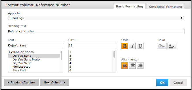
You may customize the basic formatting of column headings and fields, or apply conditional formatting to a column, by using the Format Column screen. The Format Column screen contains two tabs:
-
Basic Formatting
-
Conditional Formatting
-
In order to open this screen, open a report.
-
Click the top of the column that you want to format and select the formatting icon (
 ) and click Formatting. The Format Column screen opens.
-
Click the Basic Formatting tab, and change the following options, if needed.
|
Apply to |
Select the part of the column you want to apply the formatting. |
|
Heading text |
Type new heading text to replace the current text. |
|
Font |
Scroll through the menu to select a font. |
|
Size |
Scroll through the menu to select a font size. |
|
Style |
Click to select Bold, Italic, or Underlined text. |
|
Background Color |
Click to open the background color picker, then click to select the background color. |
|
Font Color |
Click to open the font color picker, then click to select the text color. |
|
Alignment |
Click to select Left, Center, or Right alignment. |
-
If necessary, click Previous Column or Next Column to change the formatting for an adjacent column.
-
Click OK.
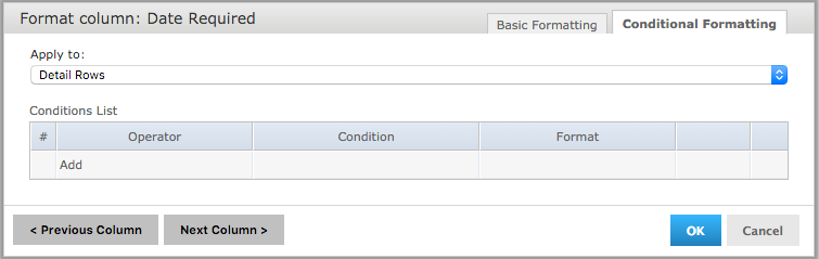
Conditional Formatting
The Report Viewer allows you to format column headings and fields, to highlight data that meets specific criteria. For instance, if you want to call out fields for certain dates on Service Request tickets, you may do so by applying text and background formatting to those stores that meet those numbers.
In order to create a condition:
-
Run your report and view it in the Report Viewer.
-
Click the header or field of the column you want to format.
-
Move your mouse over the formatting icon (
) and click Formatting. -
Click the Conditional Formatting tab. The Conditional Formatting options appear:
-
In the Apply to box, select the part of the column you want to apply the formatting.
-
Click Add. This adds a line item in the Conditions List.
-
Fill in the following information:
-
Operator: Use the drop-down menu to define how the condition is compared to the column data.
-
Condition: Enter the condition criteria.
-
Format: Select the formatting applied to fields meeting the defined condition.
-
Repeat as needed in order to add multiple conditions to a column.
If you have multiple conditions, you may want to reorder them, to ensure they do not conflict with each other. Use the  and
and  to move conditions in the hierarchy.
-
If needed, click Previous Column or Next Column to change the conditional formatting for an adjacent column.
-
Click OK. The condition is applied to the column.